Get Digs: rent payment platform
Get Digs is one of the first startups by RBC Ventures, an accelerator division under the Royal Bank of Canada. The long-term vision of the product is to improve the way people rent, the MVP version of Get Digs is a payment platform that allows renters to pay rent by credit card and as a result earn more credit card rewards on their biggest monthly expense.
Get Digs was available across Canada in English and French.
Role:
Product Designer and Researcher
Year:
2017-2019
Agency:
RBC Ventures
Phase 1: Defining the MVP
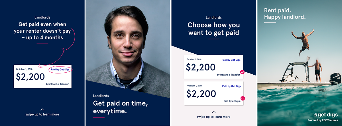
Based on market research the MVP product was primarily targeting landlords by offering them security on missed rental payments. The initial design concept was created by a 3rd party agency that explored what the complete product might be including features like unit search and tenant profiles.
The product team evaluated the agency-created concept and built out a 6-month product roadmap with immediate and future features neatly spelled out. I was tasked with refining the initial designs, creating the beginnings of the Get Digs brand, and designing the app against the product roadmap.
The MVP app sign-up process would start with a landlord inviting their tenant to pay via Get Digs. The landlord paid a security fee while tenants simply used the platform to pay. The app also briefly included a viewing calendar.

The beginnings of a brand:
The initial agency concept was assessed for feature compatibility, functionality, and accessibility. The concept was then redesigned to suit the current product needs. The brand was created simple and gender-neutral, embracing dark and bright blue colours against neon pink.
A handful of physical materials were created to be used during events, conferences, and as team swag. These included t-shirts, pens, stickers, sticky notes, postcards, and a pull-up banner.
All the early illustrations were done by a freelance illustrator who was given a specific brief and a storyboard.
Early Instagram ads targeting landlords.
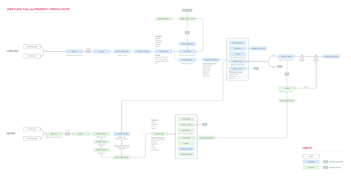
One of the many versions of a User Flow we created. This one takes into consideration all possible entry points, paths, and external platform communications.
Phase 2: Refine & pivot:
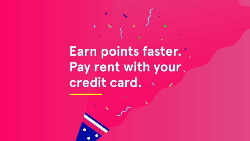
During the first 2-3 months, based on customer and market feedback, it became obvious that the product was significantly more appealing to tenants looking to earn on their rent by maximizing credit card rewards while landlords had very little interest. As a result, all landlord engagement was removed and the product journey was refined to be renter-only which caused an immediate spike in new user signups.
The feedback was collected through in-person conversations, emails, support requests, and in-market message testing. All of these tasks were performed by myself, the product owners, the product manager, and the director of marketing.
Research tools and methodologies
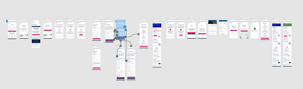
The product was consistently undergoing improvements based on real user feedback, learnings from the customer support team, and internal user testing sessions. Over the year, we created nearly a dozen different landing pages, changed the language, updated the onboarding and payment flows multiple times, and added credit card validation steps.
Adobe XD for prototyping, TypeForm for surveys, Adobe Illustrator for visual designs, ongoing messaging testing using Facebook/Instagram advertising, A/B testing of Unbounce landing pages, and even an in-person focus group.
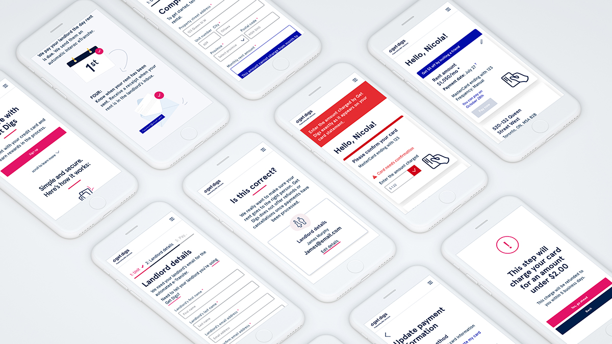
The credit card validation flow was tested with 10 users in person, the learnings helped us build a faster and easier checkout flow. The testing prototype was built using Adobe XD.
Refining the brand:
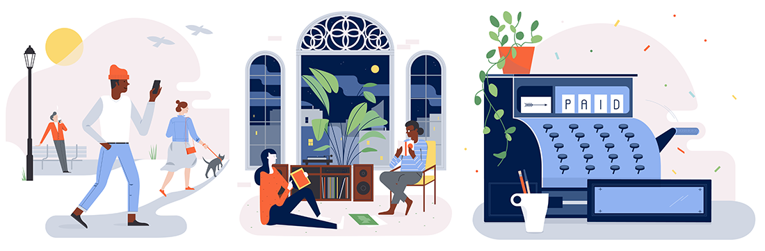
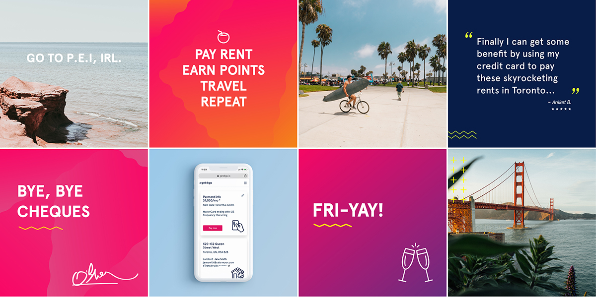
As we began to advertise more and more (primarily on social media) we continued to test and refine the brand through various creative executions. Reacting to what performed best – bright colours, large headlines, travel imagery, and authentic people – we began to update the brand, adding boiler brighter colours as accents and eye-catching gradients. Working closely with the marketing manager and on occasion a freelance copywriter we continually massaged the brand voice, looking for something smart yet playful and fun but not corny. The original set of illustrations was no longer relevant and we needed new ones very frequently so I began making them in-house.
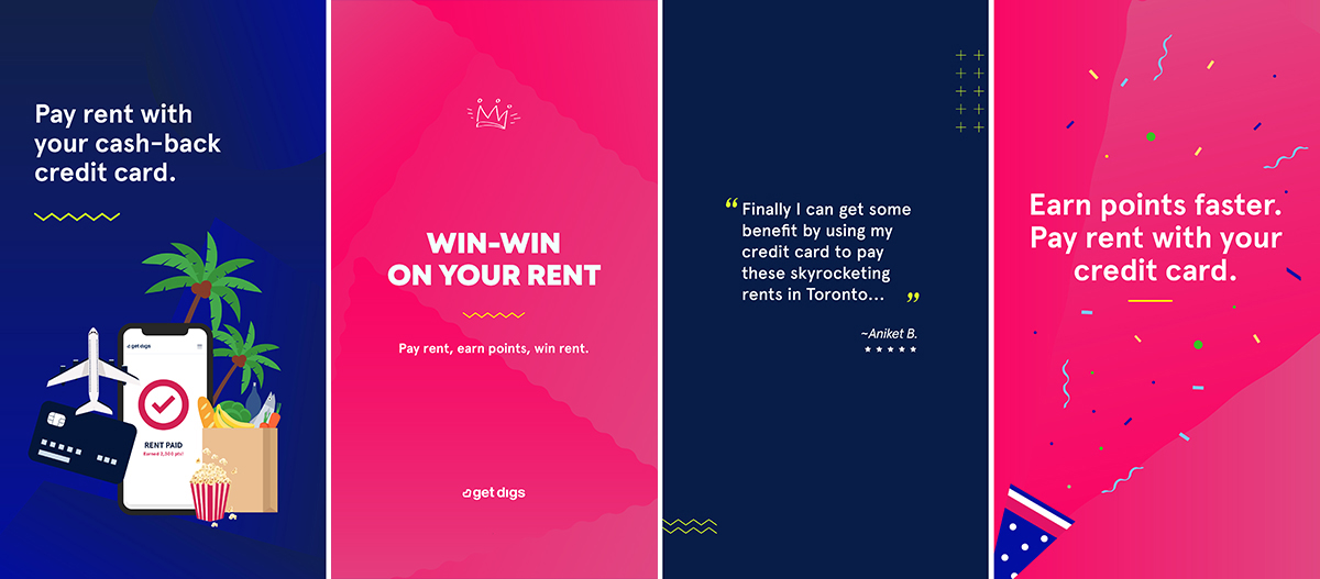
One of the key marketing campaigns, which ran for the first time in December was a signup bonus during which users were entered to win a month of free rent. Naturally, the contest required a separate set of creative and a marketing landing page.